Rules for Bodenstandig Screen Design
---> Never ever put black letters on white ground! Always use a black background because that is the original color of the monitor. Just an analogue sissy that just has bought a Macintosh would try to imitate paper on the screen!
 |
| This is how to do it. |
|
 |
| There is no glowing paper so there is also no white background! |
|
---> Avoid proportional width fonts! They have been invented in the middle 80ies and since then have brought sorrow and pain to mankind. No bodenstandig designer would ever anti-alias letters!
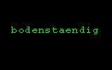 |
| Never be on the mercy of graphic software, use monospaced fonts! |
|
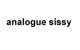 |
| Proportional width fonts not only disallow ASCII graphics but they also lead to a great waste of time while trying to make the distances between letters correct. |
|
---> Never use justified or centered text! Since the beginning of time letters have appeared in the left upper corner of the screen. Only an analogue sissy would try to balance the visual appearence.
 |
| This is a great exaple of letters arranged in a classical way. |
|
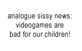 |
| A centered mess like that should be put on a tombstone but not on a screen! |
|
---> Bodenstandig cursors are never vertical lines! This fiend of compulsory analogization is a side effect of proportional width fonts.
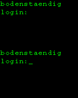 |
| A cursor to brighten up your day. |
|
 |
| And what's next? Put "Made with a Mac" symbols on your webpage? |
|
---> Colors have their own history! The most commonly known combination is probably green text on black background. Also the classic 16 colors palette -- chosen through a mathematical process for C64, EGA graphic adapters and many a operating system icon -- have not yet been fully exploited yet!
 |
| Clear, aesthetical, traditional: A combination of the classic 16 colors |
|
 |
| This gradient communicates that the designer has found a Corel Draw 8 CD-ROM within the box of his Deskjet Refill Kit. |
|
Also see The Eternal Fill Patterns!
Made according to these rules: The Most Beautiful Carpet!

