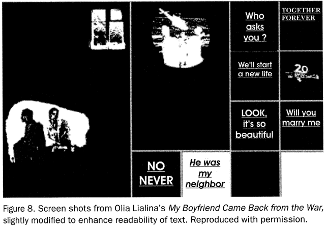
The book Avatars of Story, published by the Regents of the University of Minnesota in 2006, contains an image of Olia Lialinas My Boyfriend Came Back from the War on page 153. This piece from 1996 is considered a classic of its genre and was designed for the browser. (See Last Real Net Art Museum.) Images from the piece have been printed in dozens of books already, but this reproduction on paper marks an all time low point:
|
"Slightly modified to enhace readability of text" ... was the text on screen harder to read than this mush?
|
The printed version is different from what is visible on the screen in several ways:
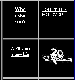
Let's close in on the printed screen shot:
|
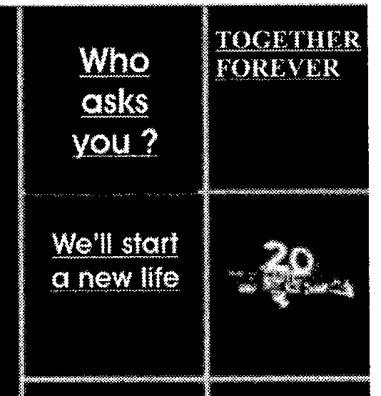
Around each letter you can see the typical shotgun bullet holes. This effect is caused by anti-aliased typefaces (rendered with "smoothed edges"), spewn out by MacOS X and most Windows operating systems. Such smoothed letters do not only contain the colors black and white, but also gray tones in between:
|
In printing there is only black ink on white paper. The gray tones have to be reproduced with black dots of different sizes and different distances from each other. (This transformation is called "halftone raster".)
|
|
To really "enhance readability of text" in the case of anti-aliased screen type for print, there are these options:
But in the case of the book and screen shot in question, the following measurements were taken:
|
To just leave the screen shot as it is would have been more adequate. Clumsily tampering with the text image in a piece that is mostly made from text didn't improve anything.
Please compare this halftone rasterized version of the screenshot with anti-aliasing switched off:
 |
The people at Apple® Computers are thinking that all bitmaps visible on the screen display photographic content -- others are on the road to adopt this opinion. On a Macintosh®, even icons look like photos. The operating system routine in MacOSX® that draws bitmaps to the monitor and that is also called by browsers, uses bicubic interpolation if an image should be displayed enlarged. While it might look okay with photos, with low resolution screen graphics it brings on the awful looking bicubic mush.
So if you are looking at enlarged low resolution screen graphics with a browser running on top of an Apple® operating system, then are making a screen shot and then having this screen shot printed, you are not really contributing to a faithful reproduction of bitmap graphics on paper. (This is obviously what happened in the case of the discussed screenshot, as the piece uses dynamically sized images and came out as blurry as can be.)
Most graphic designers are using Apple® computers and at the same time completely forgot about the actual pixels. Pixels are victims of overzealous anti-aliasing on the side of the operating system. Please, take your time with low resolution pixel graphics and find a way to bring pixels to paper in a dignified way. After that you might continue mushing photos.
![]()
![]()
Last Modification: 2006-12-28 16:26:04 | contact: drx@a-blast.org | about this site


